UofT Footprint
Making the U of T Mobile App Worth Opening
A campus discovery feature that helps students explore St. George, complete small quests, collect stamps, and save personal memories inside the U of T Mobile App.
Final prototype
A campus app experience students could actually revisit.
Footprint gives the U of T Mobile App a new role: helping students discover places, complete small quests, collect stamps, and save memories tied to campus.
Project Snapshot
My role was to keep a broad engagement problem focused and buildable.
I worked as project lead and helped manage communication with our MADLab stakeholder. I also contributed to research planning, student interviews, synthesis, feature direction, UI design, and final storytelling.
Client
MADLab
U of T Mobile Application Development Lab
Project type
Master's Capstone Project
Timeline
3 months
Team
5 UX students
My role
Project lead
Stakeholder management
Research and synthesis
UI design and project oversight
Scope
New feature concept
St. George campus
The Outcome
Final concept
Footprint turns campus movement into discovery, memory, and return motivation.
Instead of making the mobile app another place for links, the concept gives students a repeatable loop: discover a place, complete a quest, save a memory, collect a stamp, and return to uncover more of campus.

Discover
Find nearby places that feel worth visiting, not just searchable.
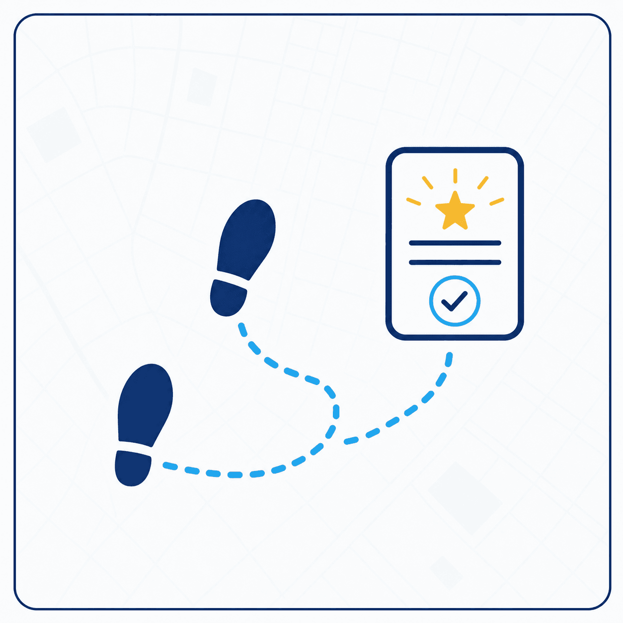
Quest
Complete a small prompt that fits between classes.

Remember
Capture a note or photo tied to a real campus place.
Collect
Unlock a stamp and build a personal campus archive.
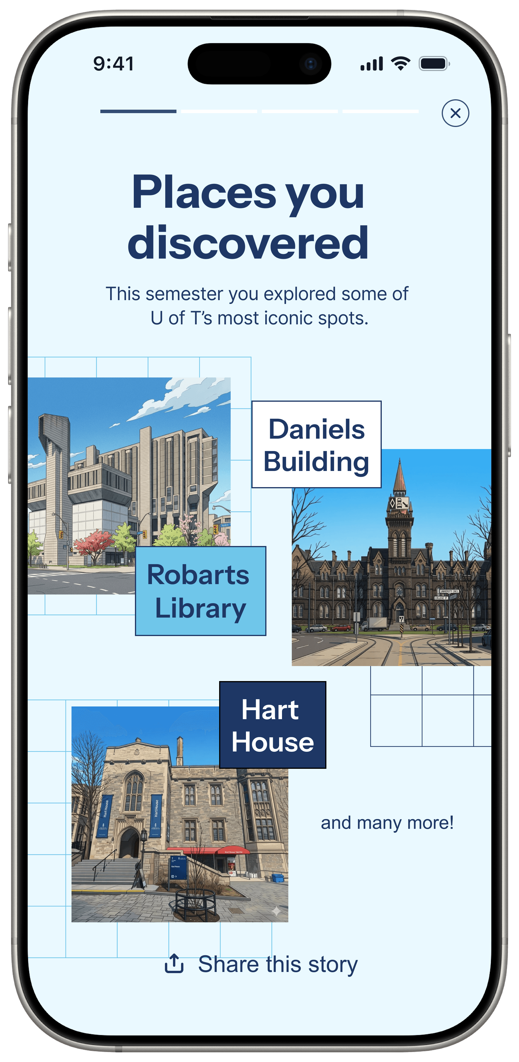
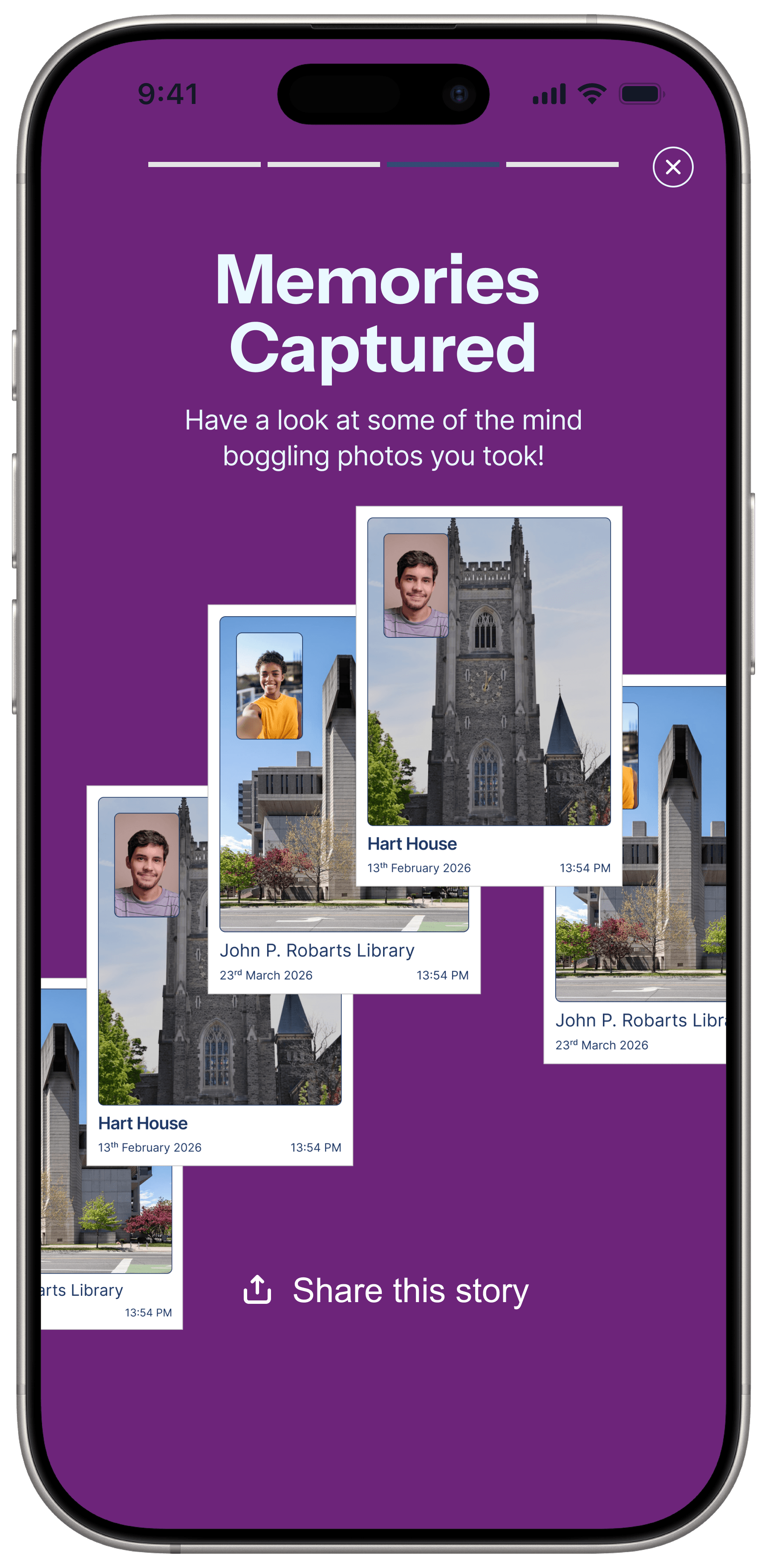
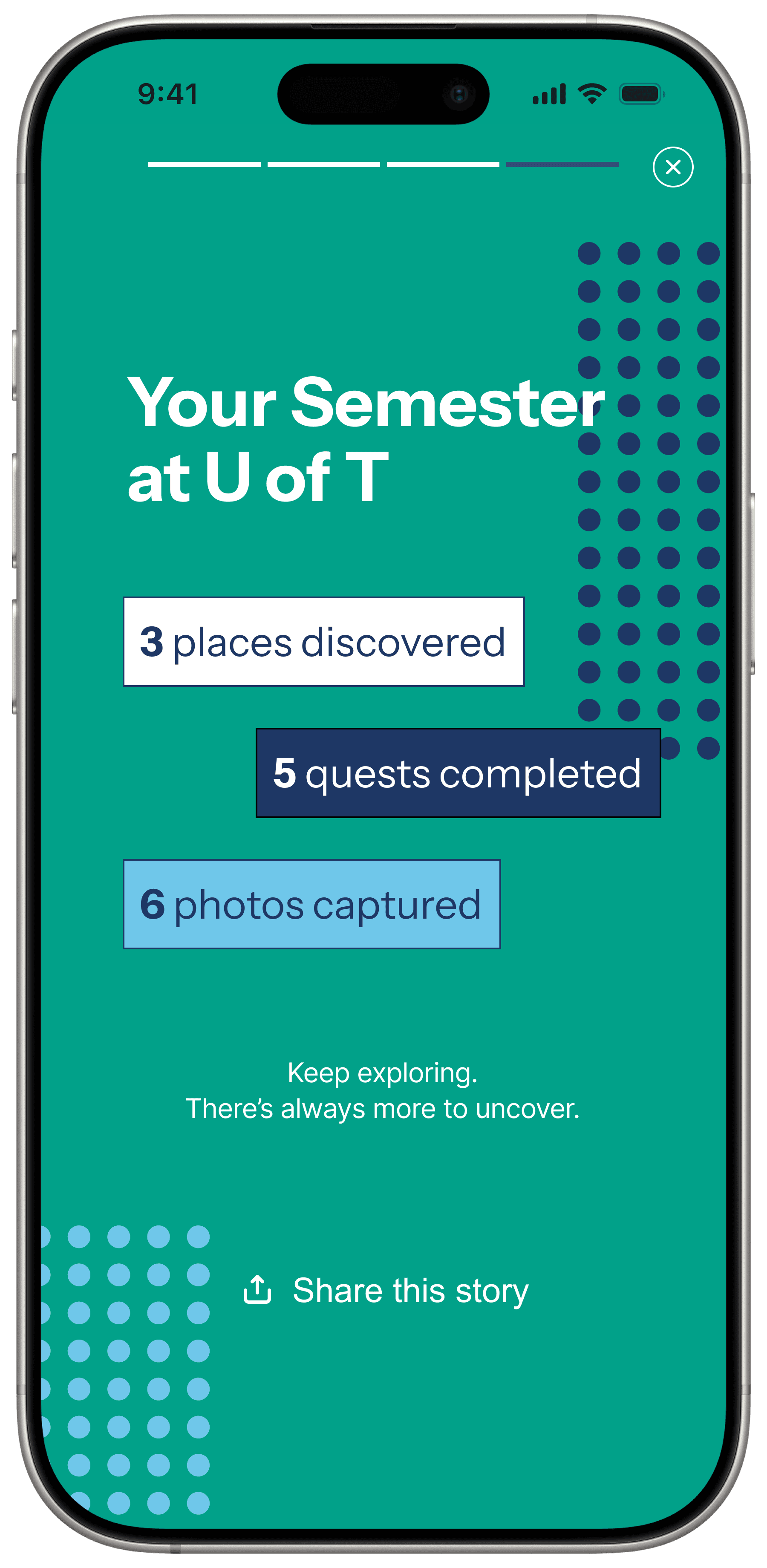
The long-term payoff is a personal record of where students went, what they completed, and what they saved.
Why This Feature?
The app existed, but it had not become a student habit.
U of T had more than 100,000 students, but the mobile app had around 8,000 downloads and roughly 250 to 300 daily active users. Students already had Google, U of T websites, maps, group chats, friends, Instagram, Reddit, and other ways to find information.
The problem was not simply awareness. The app did not have a strong enough reason to be opened repeatedly.
100k+
students
The student community was much larger than the app audience.
~8k
downloads
The app had not become a default student habit.
250-300
daily active users
Repeat engagement was far below campus scale.
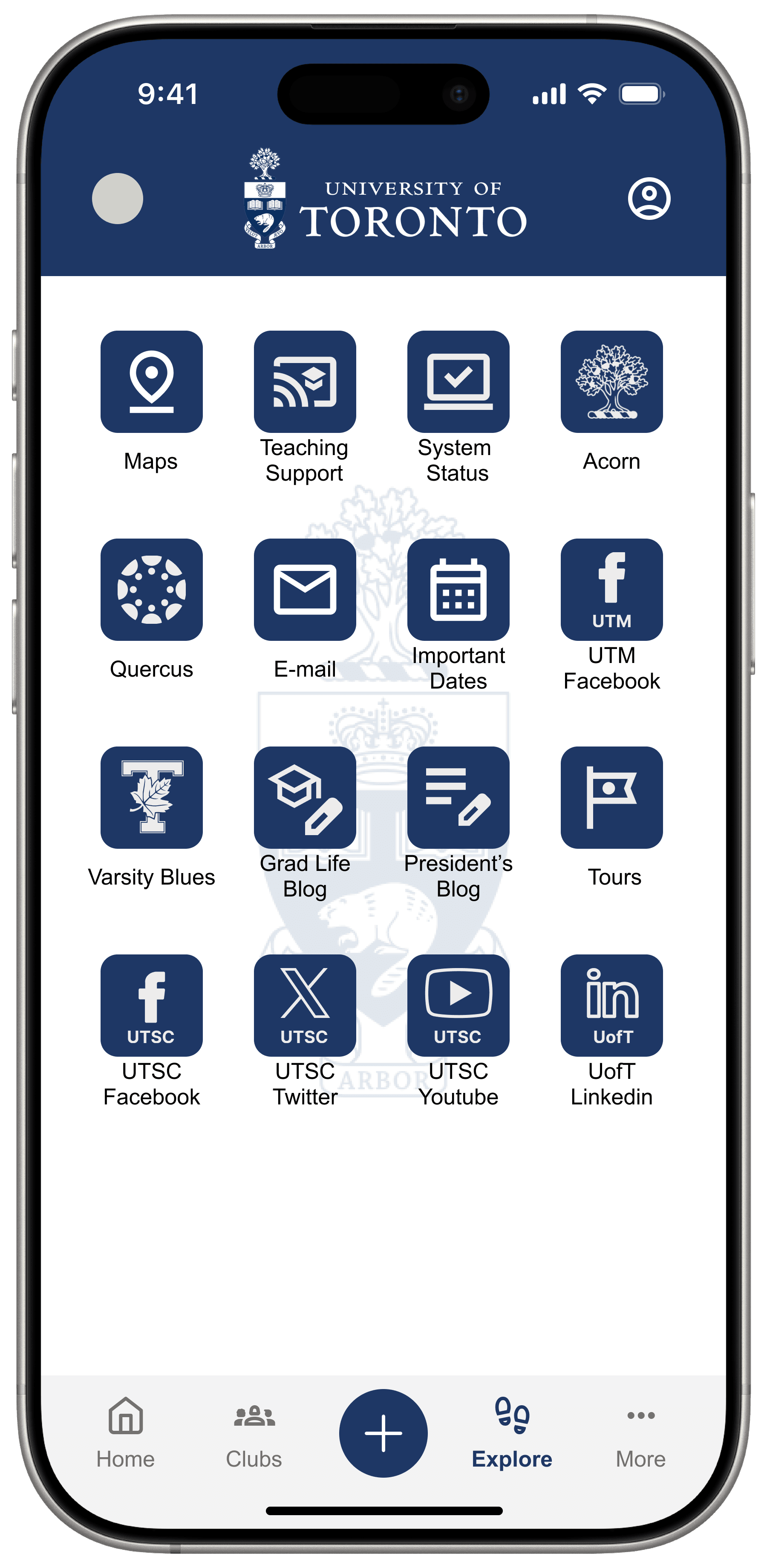
Existing app behavior
Students saw a useful but forgettable link grid.
Design implication
The answer could not just be another shortcut.
The Pivot
Utility was not enough to explain engagement.
Early research pushed us away from asking what single practical feature was missing. Students already had workarounds for finding information. The more important question became why the app would matter in the first place.
Early framing
What utility should we add?
This treated engagement as a missing-feature problem.

Final framing
Why would students care enough to return?
This reframed the app as part of campus life, not just campus information.
What feature is missing?
What would make students want to return?
How can the app be more useful?
How can the app become part of student life?
What information do students need?
What campus moments do students value?
How do students navigate?
How do students build connection with campus?
Research Process
Research stayed compact, but the questions changed.
We started with the current app and student feedback, then pivoted into campus connection, familiar spaces, memories, photos, exploration, and what students wanted to remember about U of T.

Current app audit
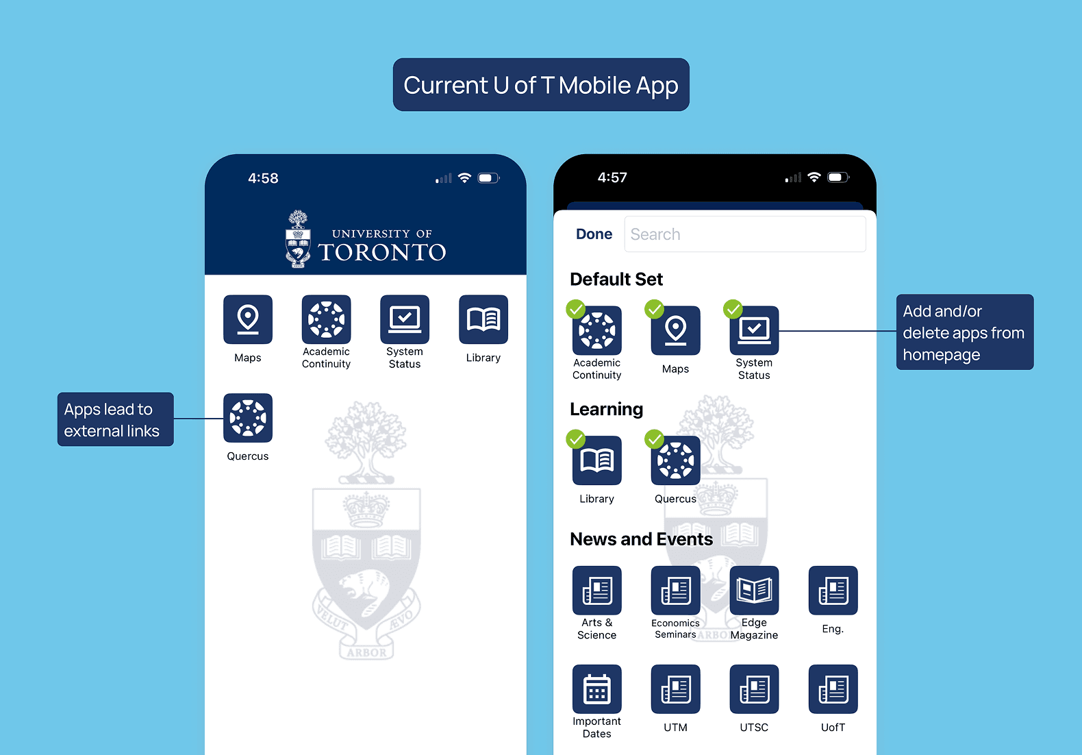
Mapped the existing app structure and where it pushed students out to external links.
Store review analysis
Looked for patterns in existing student feedback about value and retention.
Comparator scan
Used Waterloo as a reference for more centralized campus app support.

Interviews
Shifted from functional app tasks to connection, routines, isolation, and memory-making.
Discovery survey
Validated exploration, photos, pride, and collection with 60 student responses.
Current app audit
The existing app pattern was link-heavy.
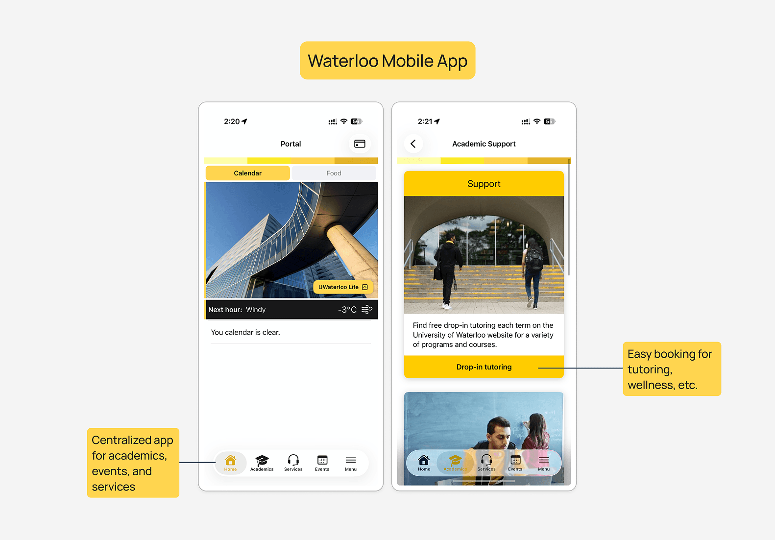
Comparator scan
Waterloo showed a more centralized student-life model.
What We Learned
The strongest opportunity was emotional, not only informational.
The research pointed to a product direction that could make campus feel more personal while still staying lightweight enough for the existing app context.
01
Students moved through campus in routine ways.
39/60 mostly stuck to familiar routes and spaces. Only 4/60 often explored new areas.
The feature needed to create low-pressure reasons to notice places students normally walked past.
02
Campus connection was personal.
Connection came from friends, photos, buildings, study spots, events, and small rituals.
The experience had to support memories and meaning, not only official campus information.
03
Lightweight collection could motivate return visits.
34/60 chose stamps or stickers as fun virtual artifacts; badges followed with 23 responses.
Stamps gave the team a repeatable reward loop without turning the feature into a heavy game.
Design Direction
Make campus exploration feel easy, personal, and worth remembering.
The feature could not feel like a complicated game. It needed to be a small layer of discovery inside the existing U of T app, grounded in real places and realistic to build.
Lightweight
Usable between classes or during short breaks.
Campus specific
Grounded in real St. George landmarks and routes.
Personal
Built around memories, not only tasks.
Repeatable
Designed to create a reason to return.
Realistic
Scoped as an add-on to the existing U of T app.
Prototype Journey
The prototype was designed as a full student journey, not a single screen.
The flow covers first-time onboarding, map discovery, quest completion, stamp collection, memory saving, and semester recap. That matters because the concept only works if the return loop is visible.
01
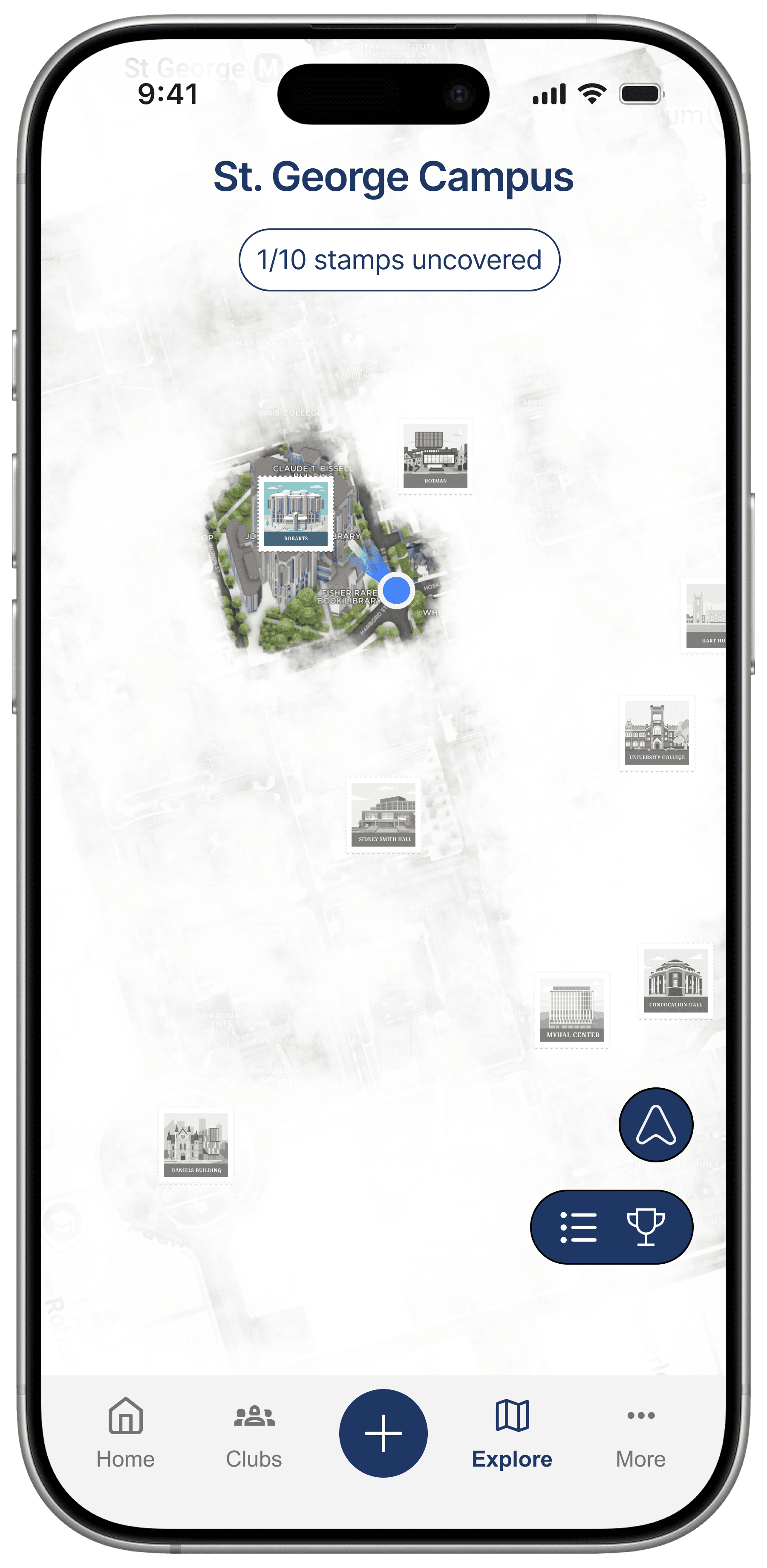
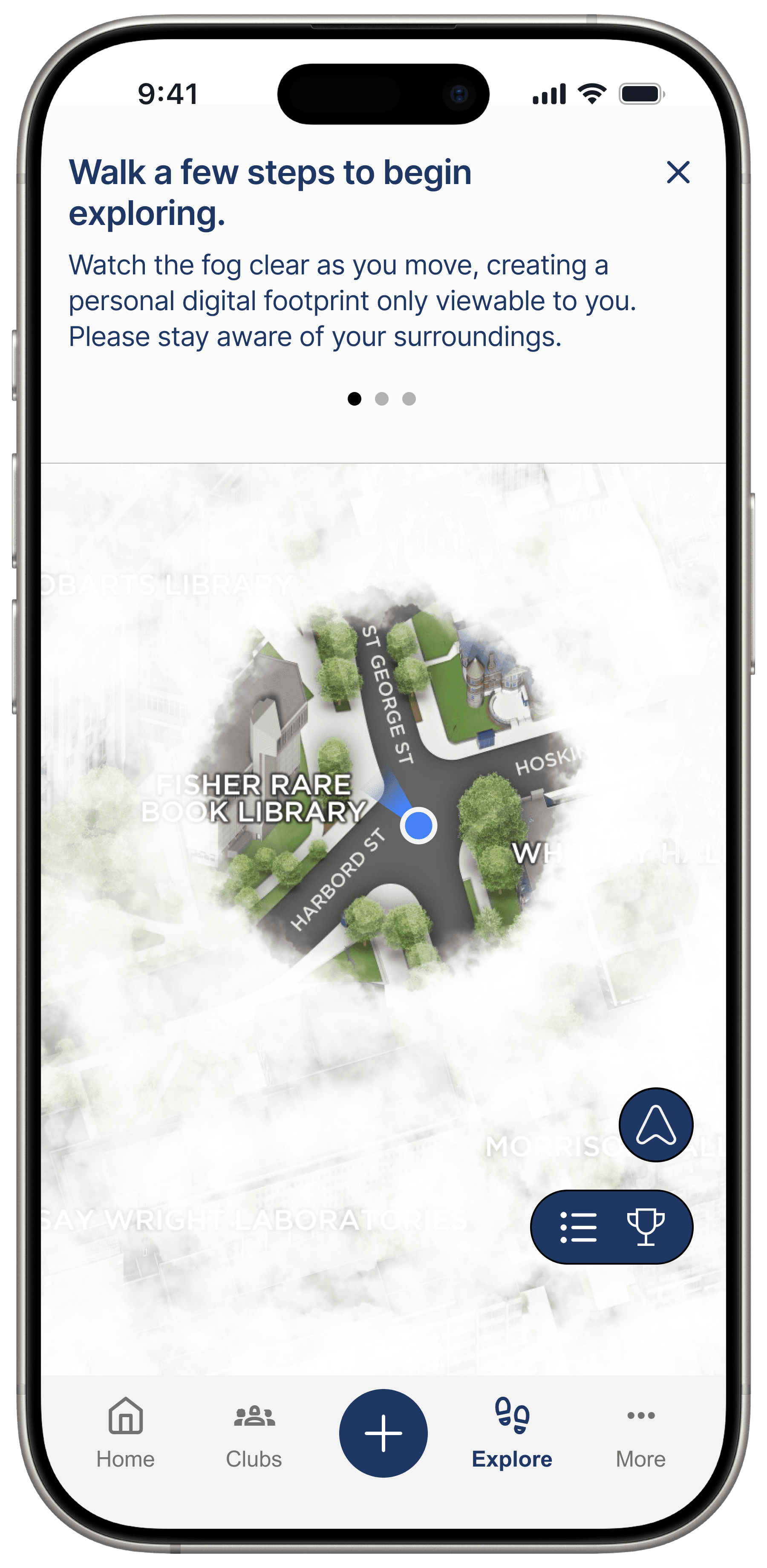
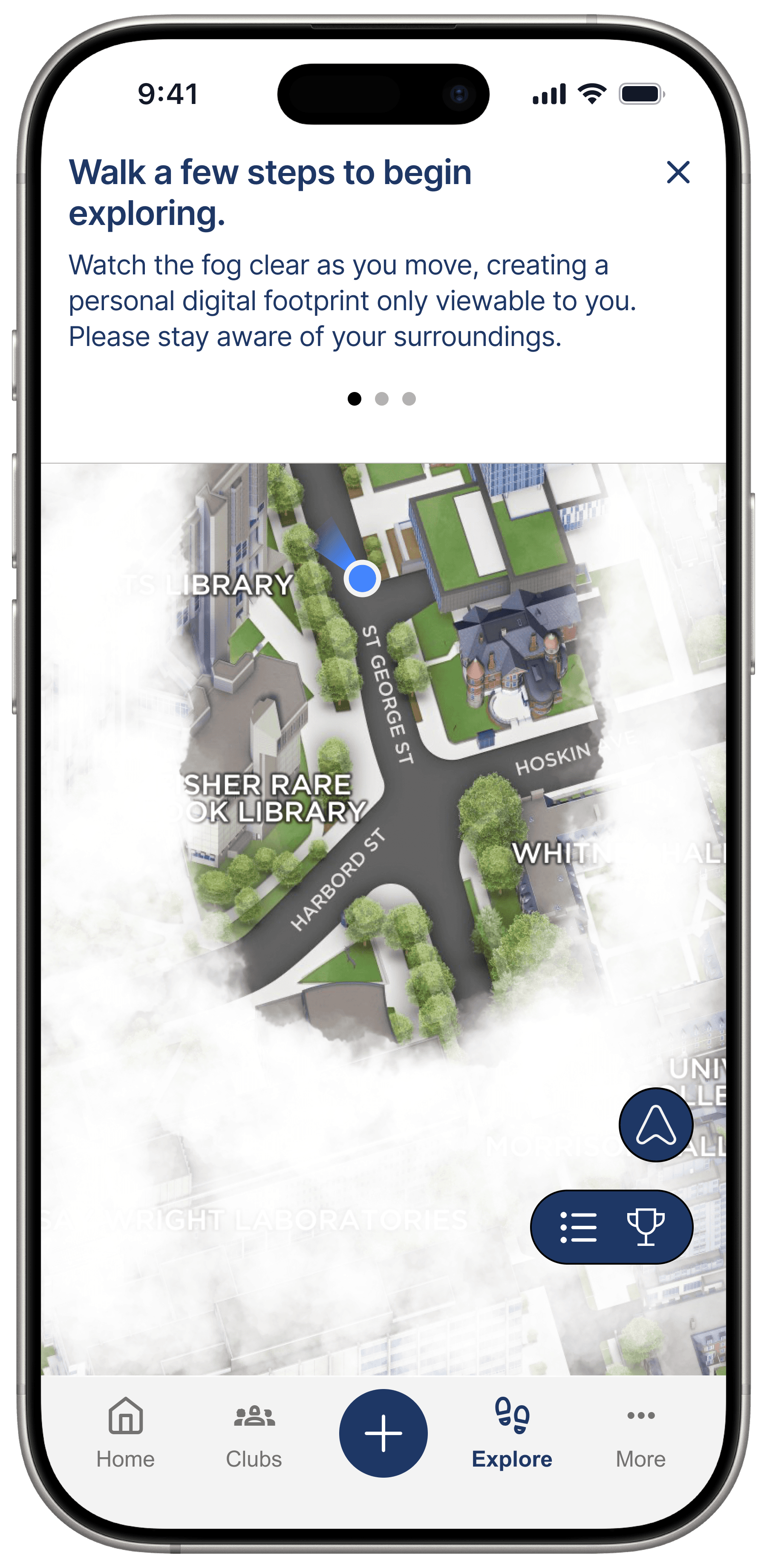
Enter a fog-covered campus map
The first-time flow frames exploration as a personal digital footprint. Students reveal campus by moving through it, making the map feel tied to their own routine.
02
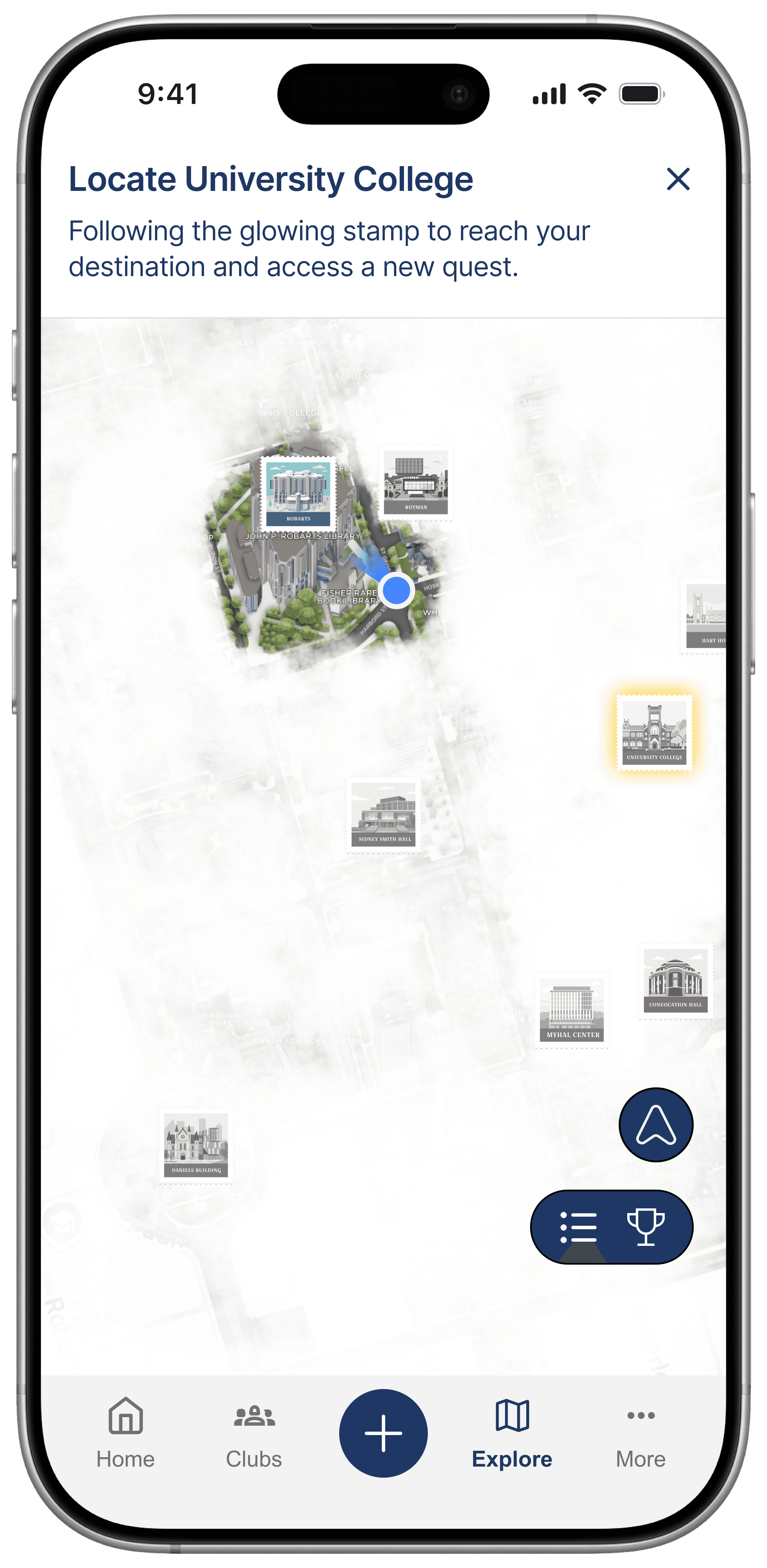
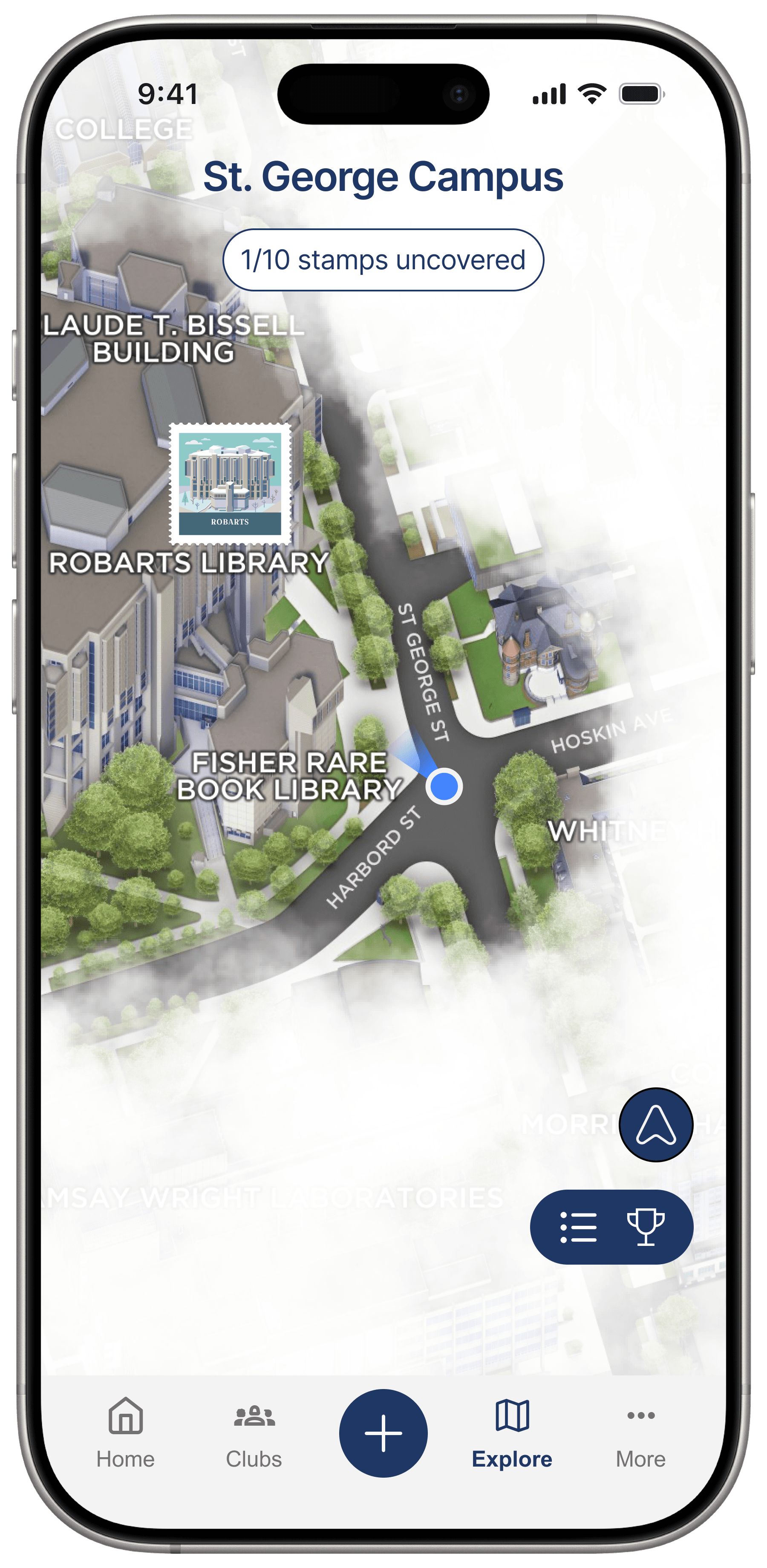
Find a nearby landmark
Pins and stamps make landmarks feel discoverable without replacing Google Maps. The point is not faster navigation; it is giving students a reason to care about where they go next.
03
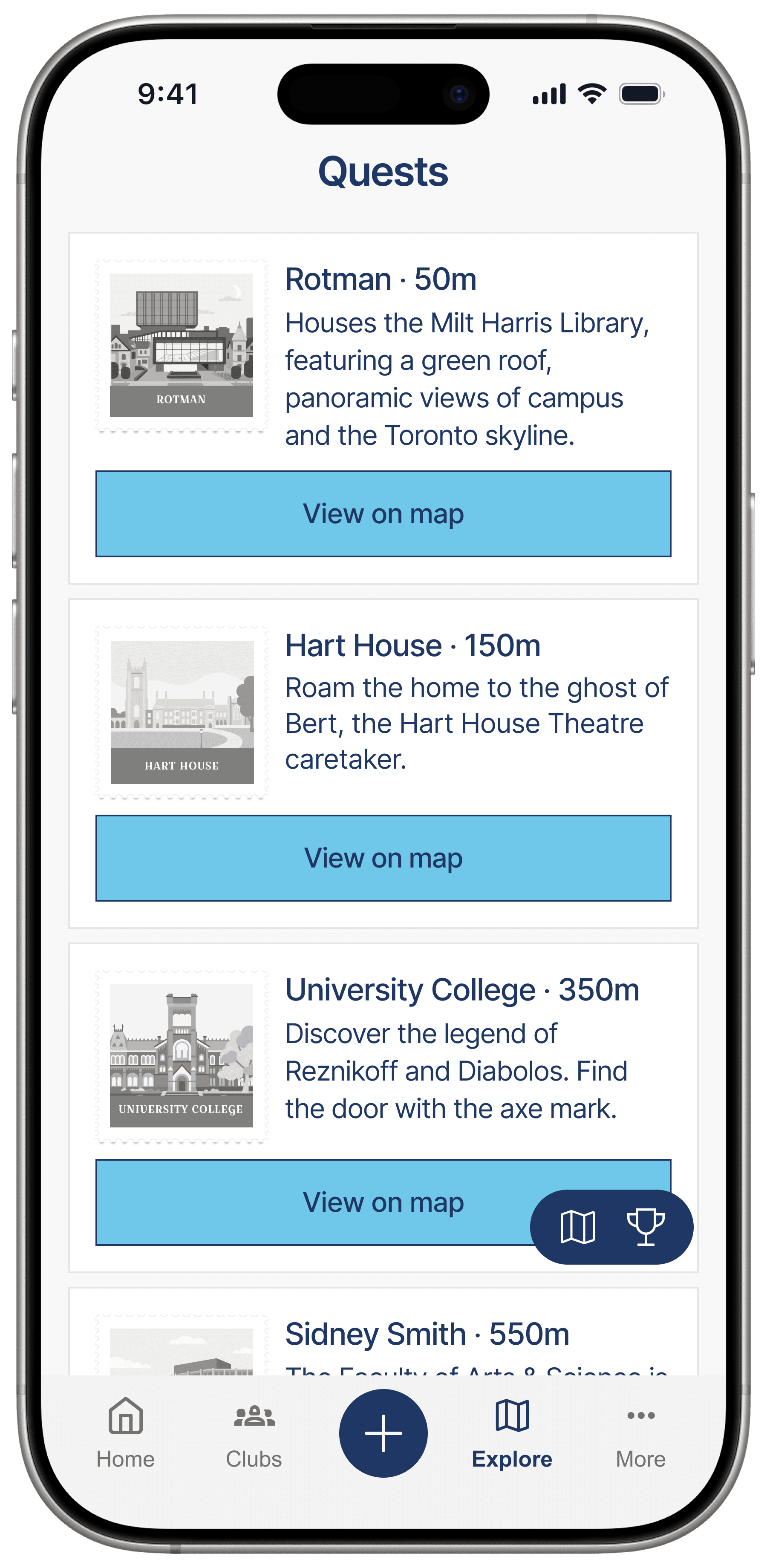
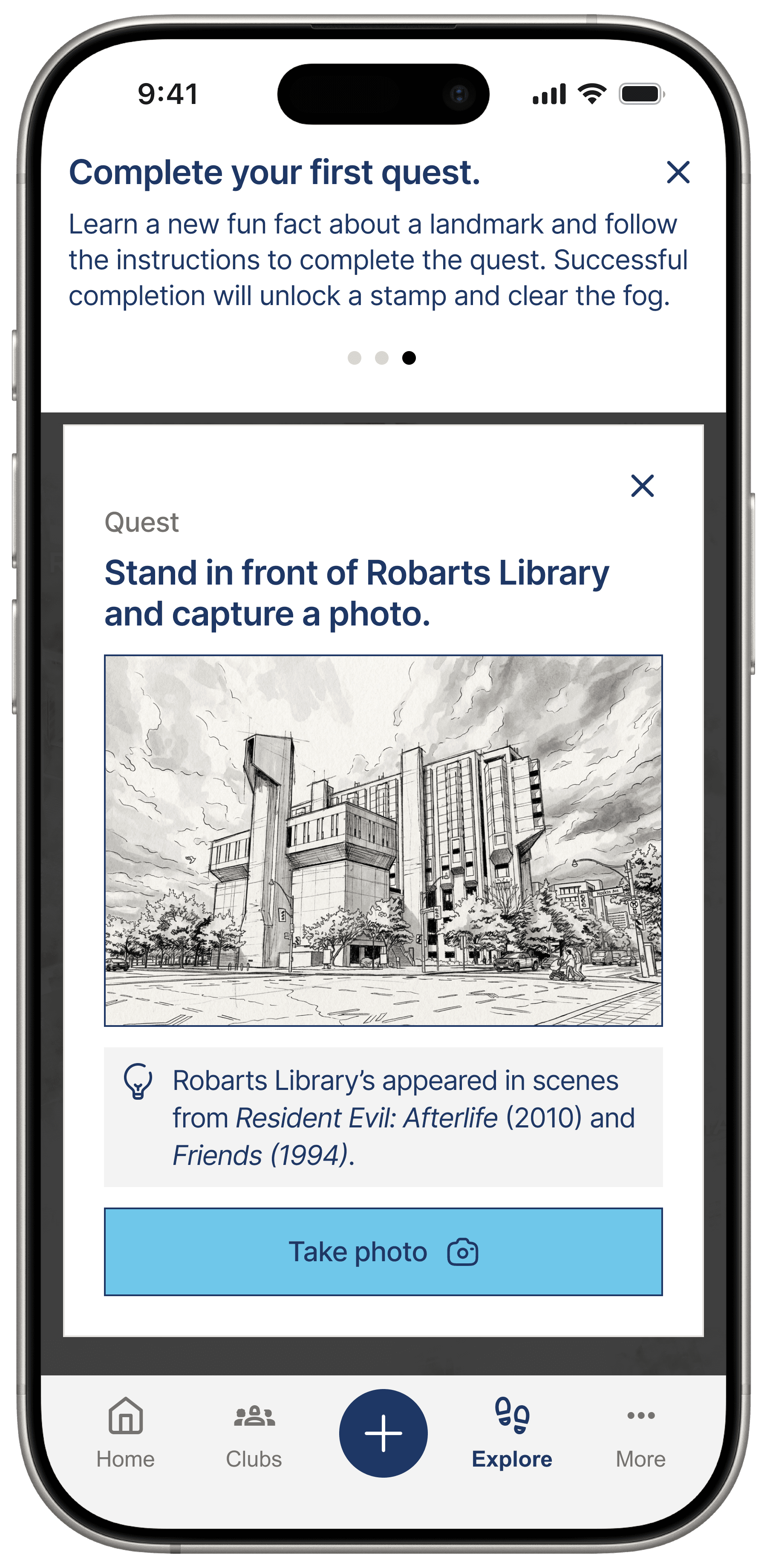
Complete a small quest
Quests turn passive waiting time into a lightweight activity. They are short enough for a break between classes and specific enough to create intention.
04
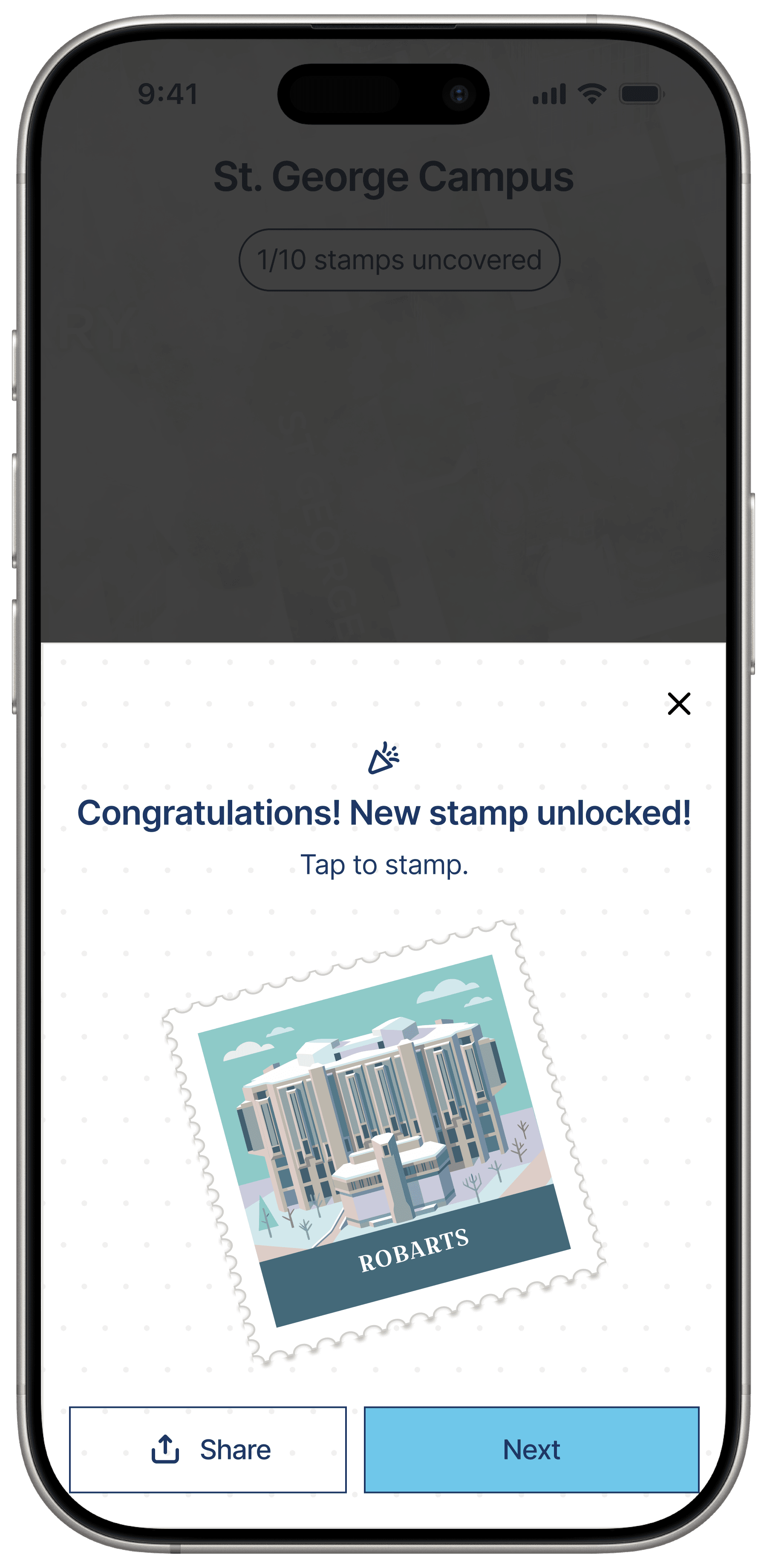
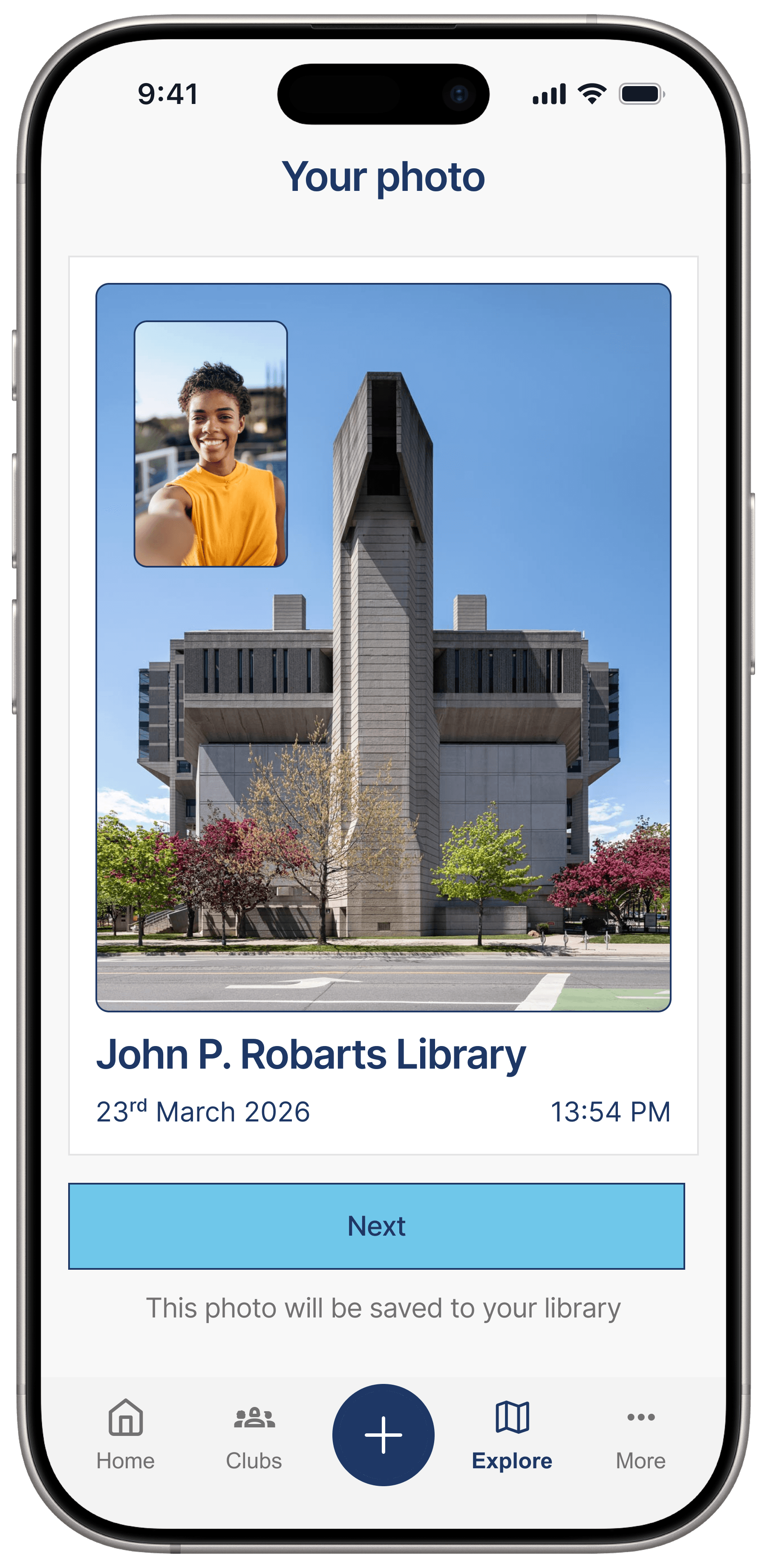
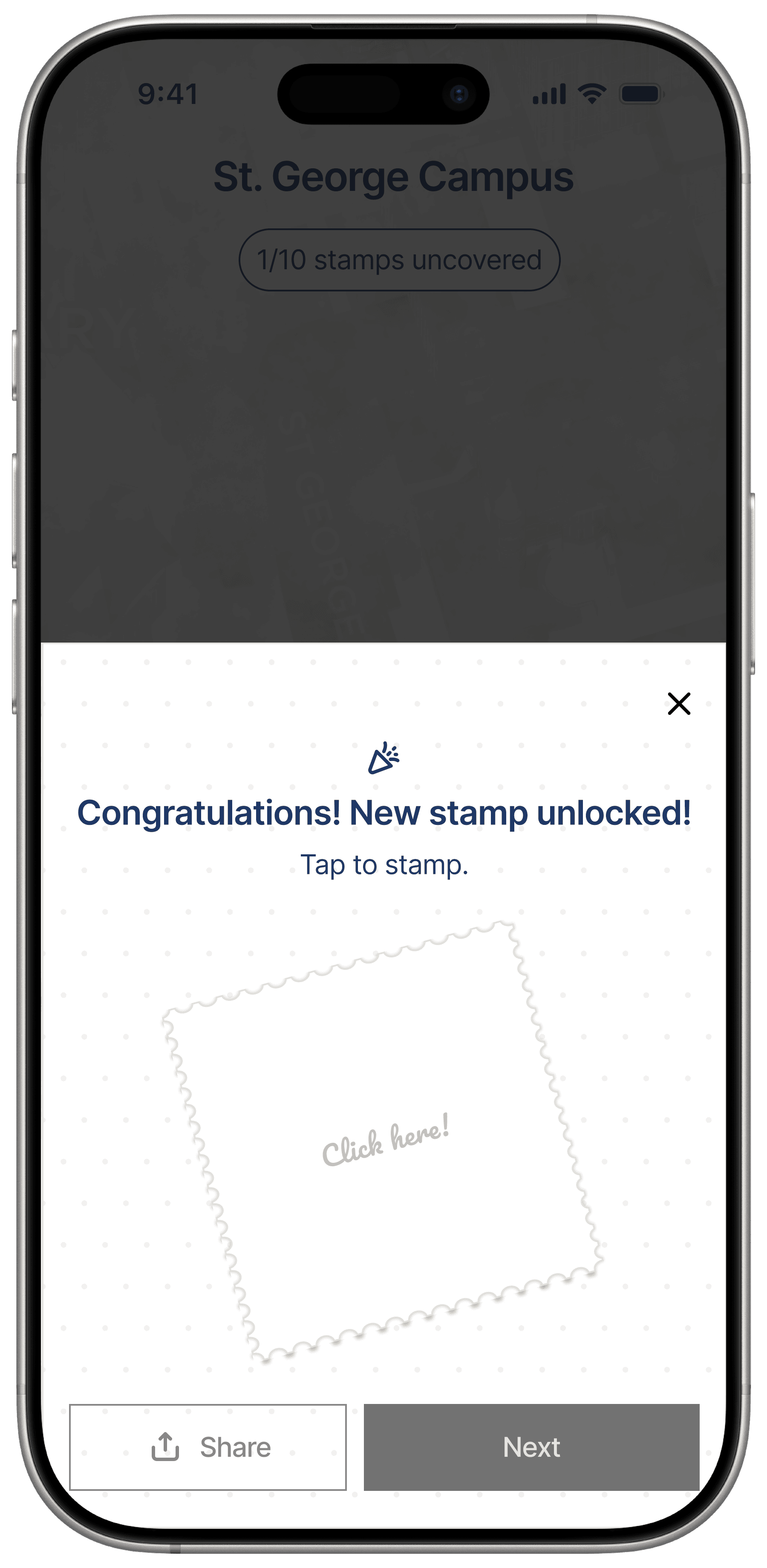
Unlock a stamp and save a memory
The reward moment connects exploration to progress, then gives students a way to save what happened there through a photo or memory card.
Key Screens
The screen set makes the product mechanics inspectable.
These screens show how a student enters Footprint, finds places, starts a quest, saves a memory, and builds a collection over time.
Footprint Entry
Introduces the feature as a distinct experience inside the existing U of T app.
Discovery Map
Shows progress, location, hidden landmarks, and revealed campus zones in one place.
Quest List
Lets students compare nearby quests by distance and decide where to go next.
Quest Detail
Turns a landmark into a concrete action with a fact, prompt, and photo task.
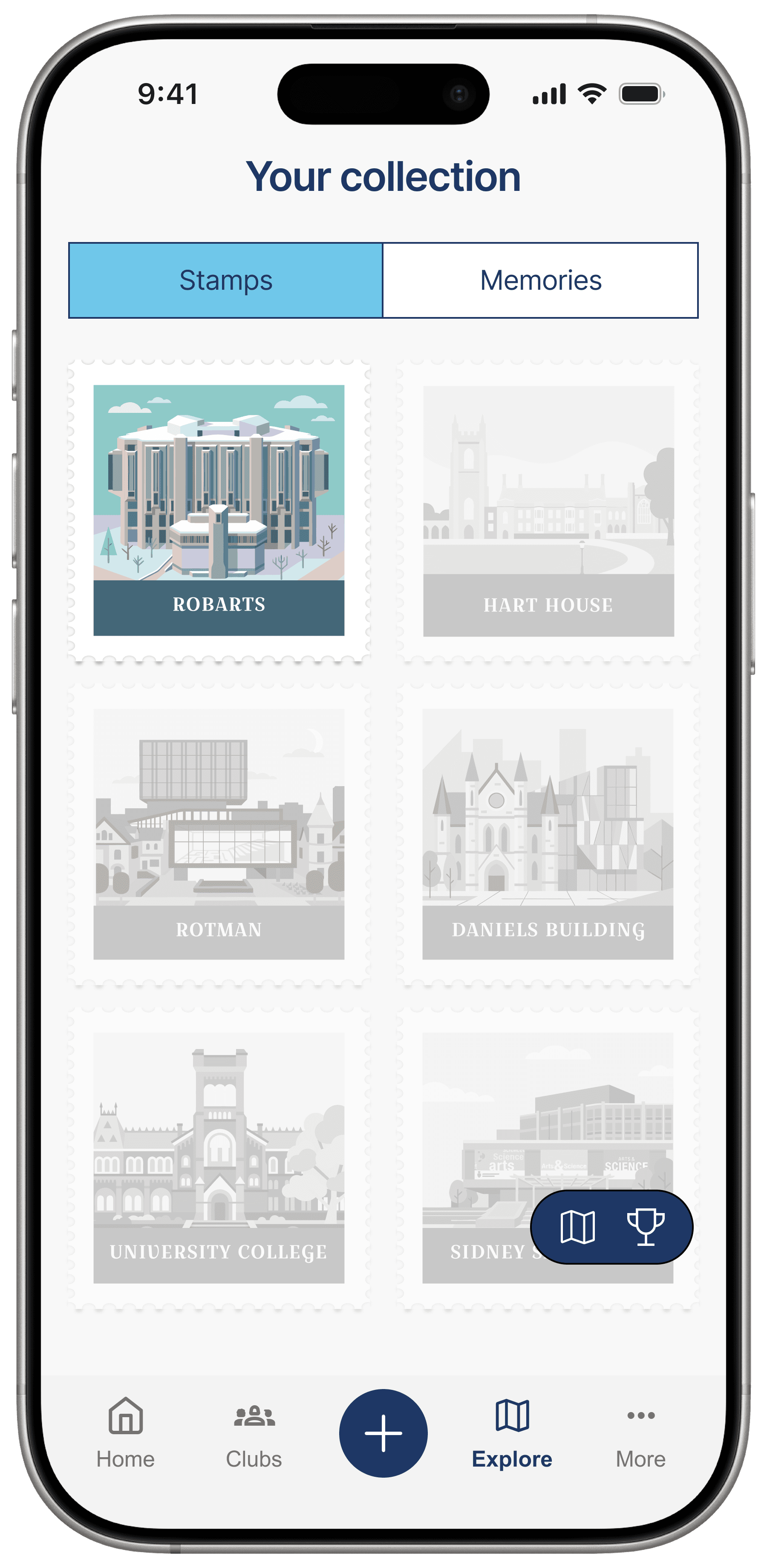
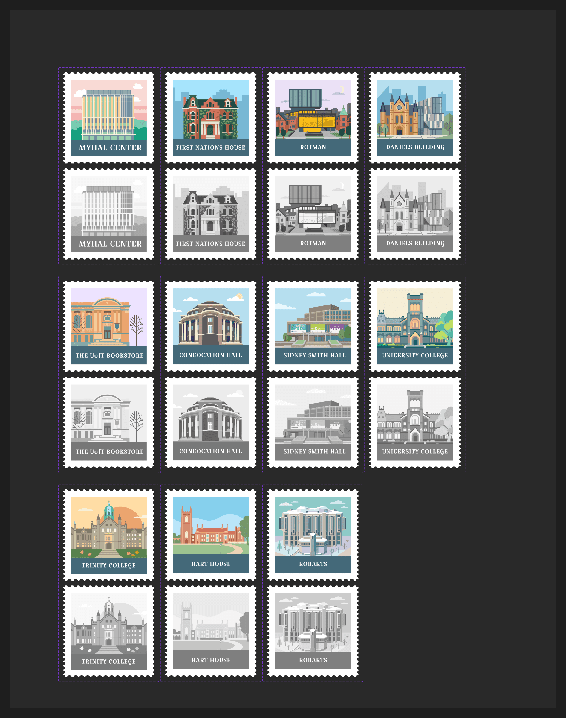
Stamp Collection
Creates long-term progression through unlocked and locked campus landmarks.
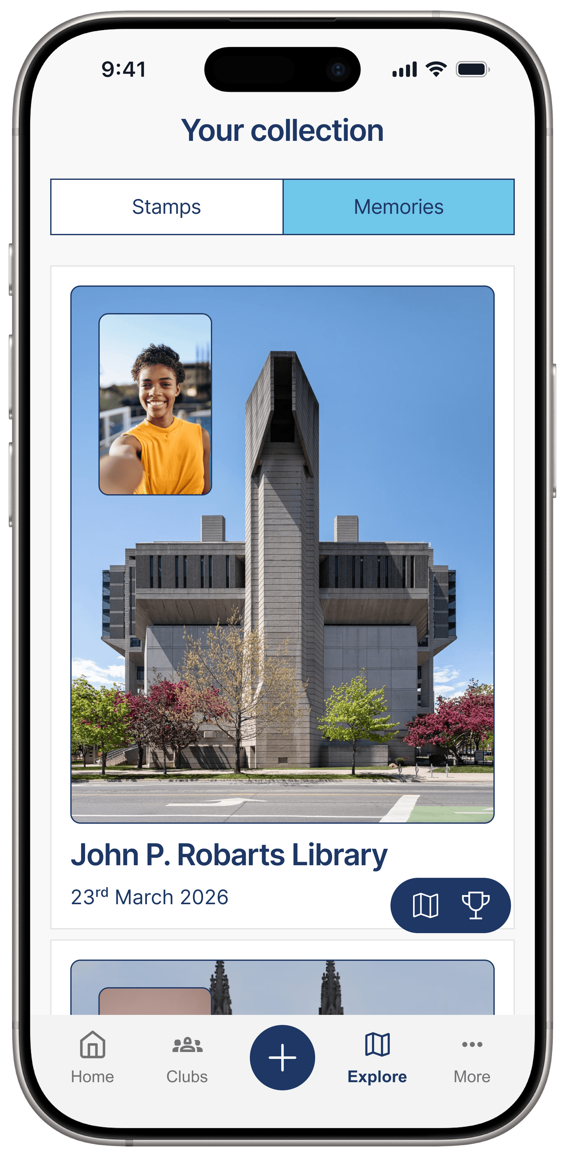
Memory Archive
Makes the experience personal by turning photos into a saved campus record.

First-time flow
Onboarding teaches the fog map, first quest, photo capture, and stamp unlock.

Returning user flow
The regular path starts from discovery, then moves into landmark details and active quests.

Semester recap flow
The payoff becomes a shareable record of places, quests, photos, and uncovered campus.
How It Responds
Every product choice connects back to the engagement problem.
Footprint responds to the app's low perceived value by creating an in-app experience that is lightweight, repeatable, and specific to student life at St. George.
No strong reason to open the app
Quests and stamps create repeat visits
App felt like a collection of links
Footprint creates an in-app campus experience
Students moved through routine paths
Discovery prompts encourage exploration
Connection came through memories and places
Memory saving makes the experience personal
MADLab needed something realistic
The feature is lightweight and scoped to St. George
My Role & Constraints
My contribution was the project framing as much as the interface.
As project lead, I helped move the team from a broad app-usage problem toward a clear product story: students needed a reason to care, not just another way to find links.
Project leadership
Kept the team aligned, managed communication with MADLab, and helped turn a broad engagement ask into a focused feature direction.
Research direction
Helped reframe interviews from functional app needs toward student meaning, campus connection, routine, and memory-making.
Synthesis
Connected interview and survey patterns to a practical product loop: discover, quest, remember, collect, return.
UI and storytelling
Contributed to the interface direction and shaped the final case-study narrative around why the product was worth opening.
New feature, not full redesign
Footprint was designed as an add-on layer inside the existing U of T Mobile App.
Lightweight build
The concept avoids a large social platform, heavy backend, or complex recommendation engine.
Privacy conscious
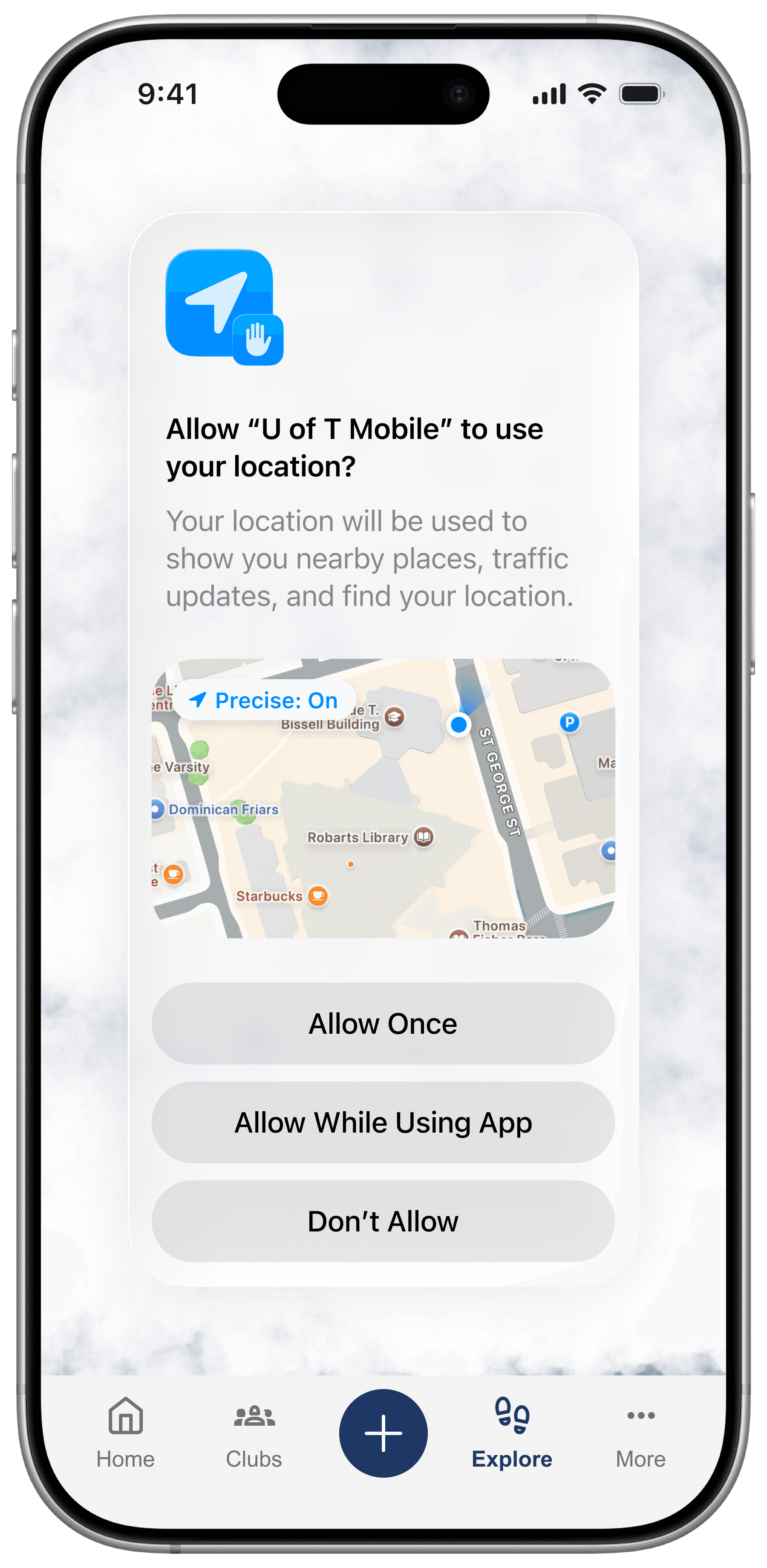
Location and memory actions are framed as explicit, optional interactions that need clear consent.
St. George scope
One campus gave the prototype a realistic boundary and a clear first rollout path.
1 to 2 academic term feasibility
The design can be phased through map reveal, landmark data, quests, stamps, and saved memories.

Consent touchpoint
Next Steps & Reflection
The next step would be testing the return loop with students.
I would test whether students understand Footprint in the first few seconds, whether quests feel motivating without feeling childish, whether memory saving belongs inside a university app, and whether stamps are enough to create repeat visits.
The main lesson was that engagement is not only about adding more features. The project became stronger when we stopped asking what utility students needed and started asking what would make the app worth opening.
A campus companion for discovery, memories, and return visits.